
Case Study
Mind & Life Institute

A sampling of our work for the Mind & Life Institute: Branding; marketing collateral; launch of a new print magazine; programs, catalogs and annual reports; and visual and UX design direction of an entirely new custom-built website. Our work for the Mind & Life Institute touched nearly every category of work in our wheelhouse.
Our work for the Mind & Life Institute touched on nearly every category of work in our wheelhouse, including branding; marketing collateral design; a new print magazine launch; workshop and conference programs; curriculum materials; and annual reports. The work culminated with a year-long effort to design and develop a new website for the Institute.
Below is a visual walkthrough of the brand evolution that we directed over the course of two years.
The Starting Point
The "Before" Brand
The Mind & Life Institute is a nonprofit organization, originally cofounded by the Dalai Lama, that studies contemplative practices and the science of the human mind. Its branding was dated, and was very much attached the the imagery of the Dalai Lama, and Buddhist tradition. While these aspects were still important elements of its mission and history, the Institute wanted to broaden its appeal, and freshen its image, while stopping short of a full rebrand. They were also looking to become more of a thought-leader and content developer within the burgeoning field of mindfulness, and wanted to take a more content-first approach, rather than only that of a event producer and research organization. Below is a look at their brand before we began.
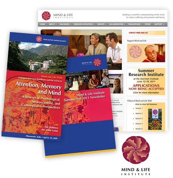
The Institute's previous "look" as shown through their old website, publications, and logo. The brand was dated, and overly tied to imagery of the Dalai Lama, and Buddhist tradition, limiting its appeal.
The Evolution
Colors and Typography
We were initially brought in to "try some new things" on a smaller scale with some of the Institute's marketing pieces, with an eye toward a larger brand refresh in the future. Our first pieces, a direct mail postcard series, explored a new color palette, and more current approach to typography. The look was targeted at the broader community that practiced, and were interested in "mindfulness." For these pieces, we kept the existing logomark, but downplayed it, and looked for colors that worked with, but expanded upon the traditional red.
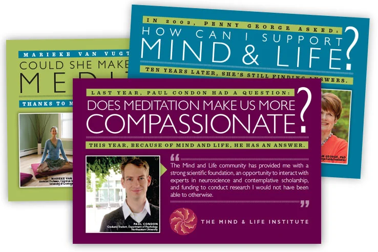
A direct-mail postcard series, exploring elements of a new brand.
BOLDER IMAGES; REFINED BRAND MARK
Moving beyond the postcard series, we revamped some of the materials for the many events and conferences the Institute sponsored, working with bolder, more abstract images; simplifying the logomark into a flatter design and using it in a more abstract manner; and integrating the new typography and color palette. We rolled this new look into additional marketing pieces, conference programs; and a media/donor kit.

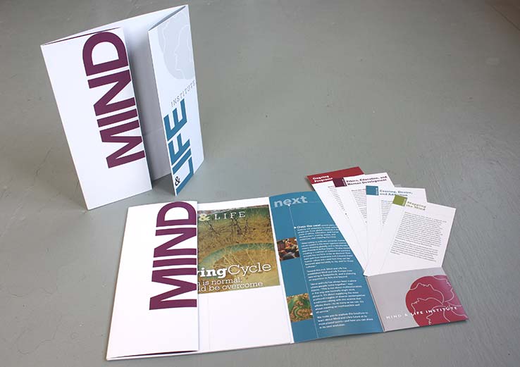
Conference programs, and a media/doner kit.
Content First
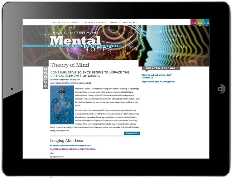
Mind & LIFE MAGAZINE
In addition to the visual changes with the brand, the Institute wanted to be looked upon as a content producer, and thought leader in mindfulness. Working with the organization's communications director and research team, we relaunched what was previously a mostly institutionally-focused newsletter, reimagined as a more literary and visually inspiring magazine that sought to explore the core themes of the organization in a deeper, and more though-provoking manner. Articles were illustrated more conceptually, with evocative, rather that literal, imagery. You can read more about the rebranding and magazine launch here.


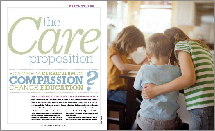
Some layouts from the first two issues of Mind & Life magazine
CURRICULUM Development
Going deeper with content production and thought-leadership, the Institute developed a curriculum to teach young people compassion, and the principals of mindfulness. For this we produced a teaching guide with lesson plans, exercises, and instructional examples.

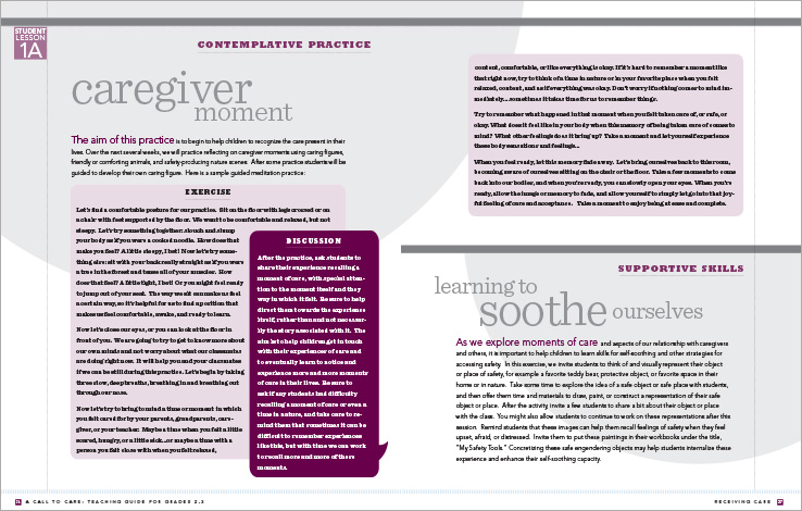
Curriculum guide
Reimagining the Website
Mindandlife.com
With the elements of the new brand complete, and the basis of a content-strategy established, we launched into what would be a 15-month long process to transform the Institute's website to align with their new branding and content focus.
Where the previous site presented primarily institutional news with a traditional navigation structure, the new site frontloaded original editorial content, indepth research, and essays that explored the Institute's core themes. The primary visual impact was shifted to highlight this content with a homepage slideshow front-and-center.
The more institutional content—which was still important—was never more than a click away, however, thanks to a novel visual dropdown navigation. In addition, a distinctive blog created a place for the reader to explore the Institute's core themes in a more timely and personal manner. You can read a more indepth post on the development of the new site here.


Some pages from the revamped mindandlife.com
Taken as a whole, our work with Mind & Life is a great example of how our deep experience with content—whether for print editorial, instruction, marketing, or online—can create effective communications materials across a wide spectrum of media. While editorial content is different than marketing content; and print is consumed differently than online, we are able to understand the unique aspects of each presentation medium and audience, and make sure that all are executed optimally, and that the overall brand unity remains solid.